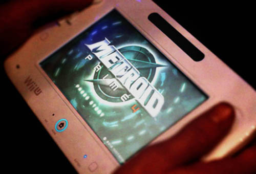
A (fake) screenshot of Metroid Prime 4 on Wii U?

We’re a mere 15 hours away from Nintendo’s press conference, and the above, purportedly leaked image of Metroid Prime 4 running on the Wii U has popped up on NeoGAF.
Fake or not? I’m leaning towards fake, personally – it looks like a slightly modified version of the Metroid Prime Trilogy start screen, and the low, grainy resolution could be an attempt to cover up the photoshopping artifacts.
We can deliver all the latest Wii U news straight to your inbox every morning. Want in?


Honestly I hope Retro wasn’t working on another Metroid Prime. I loved the games but I want to see what Retro is capable of like in Donkey Kong Country Returns.
But if it IS MP4 I’m still buying it regardless.
The graininess does make it appear fake BUT I have never seen that particular shot of the WII U Gamepad and it is the redesigned one at that. I guess we’ll know soon enough.
Also, it is possible that it isnt Retro that would be working on Prime 4.
It’s fake.
If you look at it well enough, and compare it to a picture of the prototype next to the production one, you’ll see it.
http://storage.siliconera.com/wordpress/wp-content/uploads/2012/06/wii_u_gamepad_thumb.jpg
First obvious hint: The D-pad is directly below the thumb stick, which in this case is a circle pad if you look closely. Even if you pressed the thumb stick all the way to the right on the new version, it wouldn’t get that close to the screen. It is close to the screen, like it was on the prototype version.
Second: The right thumb stick, which also is a circle pad, is also too close to the screen. Not enough space there to be the new production version.
Third: The Wii U logo is slightly tilted compared to the screen, a sign that it was shopped in there and not completely aligned.
Fourth: The space beneath the thumbstick. On the prototype it shaped into the controller, but on the new version, with analog sticks, it has a lifted edge. The one on this picture is like the one on the prototype version.
Fifth: The mystery button we now know as the TV control button is clearly a button when you look at real pictures of the controller, but here it looks like the NFC sensor. Like it isn’t clickable.
What do you think?